Typographic identity
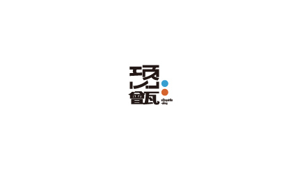
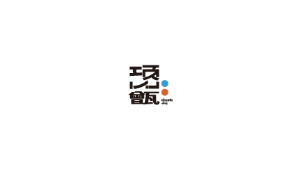
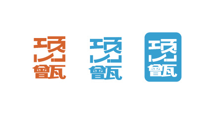
The Chinese logotype was developed into horizontal, vertical, monochrome, and compact variants for flexible use.
A bright identity system for a regional citrus brand
01 / Overview
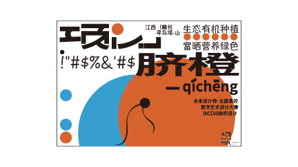
A brand and packaging design project for a regional navel-orange product. The system combines expressive Chinese lettering, a high-contrast orange-and-blue palette, and modular fruit-inspired graphics across logos, cartons, labels, and retail displays.
02 / Challenge
The packaging needed to communicate freshness and regional character while remaining recognizable across different sizes, surfaces, and point-of-sale contexts.
03 / Process
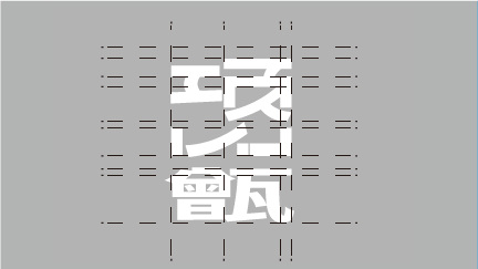
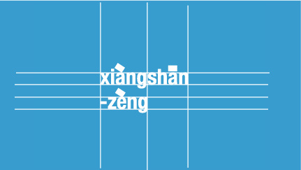
The Chinese logotype was developed into horizontal, vertical, monochrome, and compact variants for flexible use.
Orange conveys the fruit and warmth, while cyan creates contrast and a contemporary shelf presence.
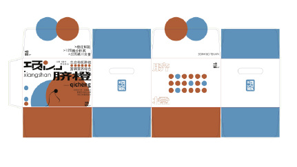
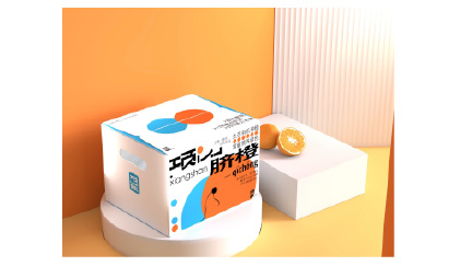
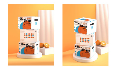
The identity was extended into structural packaging, labels, product boxes, and stacked retail-display mockups.
04 / Outcomes
05 / Full project presentation
Selected portfolio spreads showing the research, design process, and final outcome.

06 / Reflection
The project demonstrates how a compact visual system can connect typography, packaging structure, and product presentation. Further development could add material testing and retail user feedback.